ILLUSTRATION CONTEST 2024
Column
Behind Drawing Pokémon TCG Illustrations
“Bringing an Illustration to Life” (Part 1)
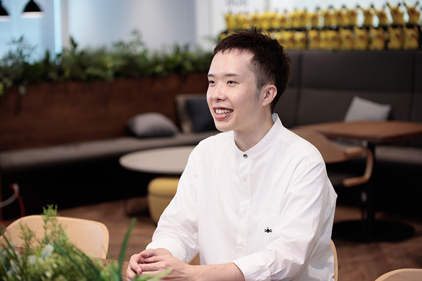
We asked Atsushi Furusawa, who has created many illustrations for the Pokémon TCG, about the thoughts and techniques that go into the process he uses to create his art.
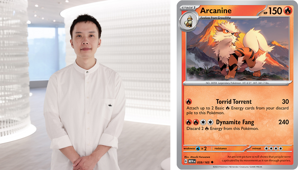
Atsushi Furusawa
Illustrator. Atsushi Furusawa has been illustrating Pokémon cards since 2021. He made his Pokémon TCG debut after applying to the first Pokémon Trading Card Game Illustration Grand Prix in 2018. Since then, he was in charge of the art for the promo cards given out as early purchase bonuses for the Pokémon Legends: Arceus, Pokémon Scarlet, and Pokémon Violet games. He likes Pokémon that have simple shapes, especially Magnemite.
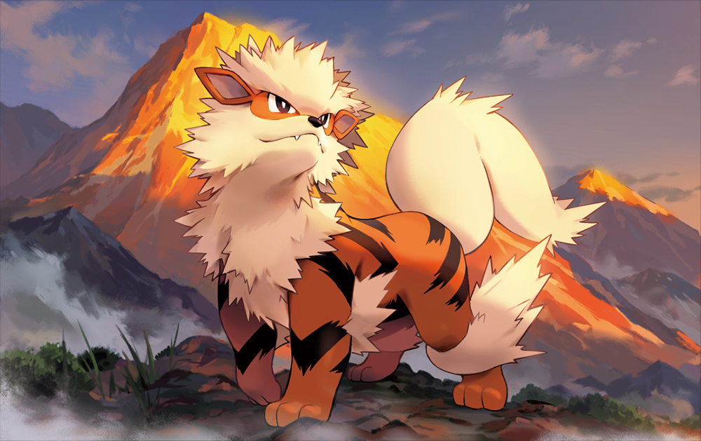
「Arcanine」 Illus. Atsushi Furusawa
Included in the Pokémon TCG: Scarlet & Violet—151 expansion
“What I think about when illustrating”
―Please tell us about the guiding principles you follow when drawing Pokémon TCG illustrations.
(Atsushi) Furusawa: When illustrating, I want the players to realize the charm of the Pokémon subject in new ways. My goal is to make people think things like, “Wait, was this Pokémon always this cute?” Or, “Wait, did it always look this cool?”
Step 1: Research
―Please tell us more about how you do research for your illustrations. What kind of materials do you use to prepare before drawing Pokémon?
Furusawa: I make production notes and prepare as much as possible in advance. First of all, I look through the Pokédex in the video games, read the descriptions for the Pokémon, and write down the keywords that struck me the most. In the case of Arcanine, I penciled out the notes, “It runs gracefully, as if on wings.” and “It runs agilely as if on wings.”
Next, in order to better understand how the players who use a certain Pokémon in the game feel about it, I take notes on its attacks, stats, Abilities, and so on. The method for evolving that Pokémon is also very important. I also look into the Trainers and other characters that Arcanine appears with and adventures alongside in the games and TV series.
―So, your production notes are similar to what is usually called a “mind map.”
Furusawa: Exactly. I have “Arcanine” in the center and the keywords I run into during research spreading out from there. Then, when the keywords I have written down make me think of another idea, I write that down as well. As I keep writing more and more about Arcanine, I start considering what I personally feel when thinking of it. Then, I start focusing on how to portray it. I asked myself how I could make Arcanine look as cool as possible. In this case, this led to two ideas: showing it running with clouds down below and having it stand on a mountain top.
―You don’t just research the Pokémon, you also try to select the scenarios and locations that are most appropriate for it.
Furusawa: I often draw concrete backgrounds*, so I try to think carefully about choosing a scenario that fits the Pokémon subject.
(*Concrete backgrounds depict realistic, discernible locations, such as mountains or forests, as opposed to abstract art backgrounds.)
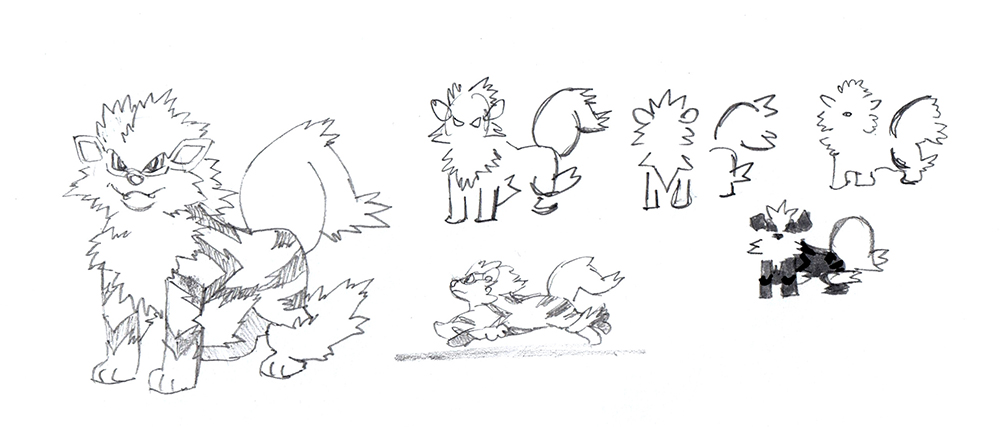
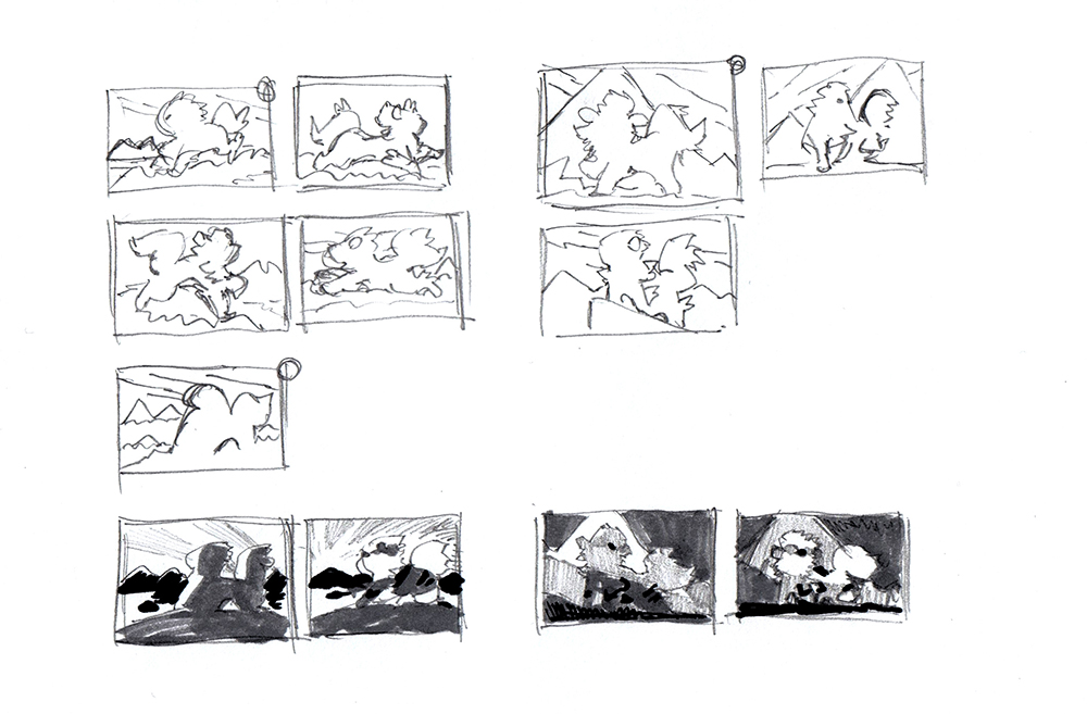
―Your production notes also include a few sketches of Arcanine.
Furusawa: The one on the left was my first attempt at imitating an official illustration. The ones I jotted down on the right were an experiment to see how much I could simplify the components that make Arcanine Arcanine. Simplifying it like this helps you understand, for example, that Arcanine is generally spiky but has a round tail. So, you can start thinking of where to place the curve of its tail within the illustration.
Step 2: Drafting and Supervision
―Why did you create two different drafts?
Furusawa: During the research step, I came up with different concepts that I thought would work for Arcanine, so I went ahead and drew both. Draft A (on the left) shows Arcanine running with the clouds down below. Draft B (on the right) is an evolution of the idea I originally had of drawing Arcanine on a mountain top. The mountain becomes a background component that highlights Arcanine’s regal elegance.
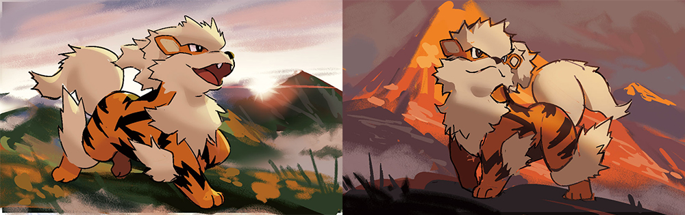
On the left is Draft A, showing Arcanine running with clouds down below.
On the right is Draft B, showing a majestic Arcanine with a mountain in the background.
It was eventually decided that Draft B would be used.
―The mountain in the background of Draft B is very impressive.
Furusawa: In mountaineering terms, the sunset hitting a mountain and making it appear red is called “Abendrot.” I think that this is a very cool phenomenon in itself, and the red color also perfectly fits Arcanine as a Fire type.
―Please tell us what you are particularly careful about when creating your drafts.
Furusawa: Pokémon TCG illustrations must go through supervision at the draft stage. So, I try to draw as carefully as possible, but this can be done relatively quickly thanks to the notes and composition ideas I came up with during the research step.
Composition ideas in the production notes. During this stage, in addition to the placement of the subject, shading is also taken into consideration.
―What art supplies, equipment, and tools do you use to create your drafts and illustrations?
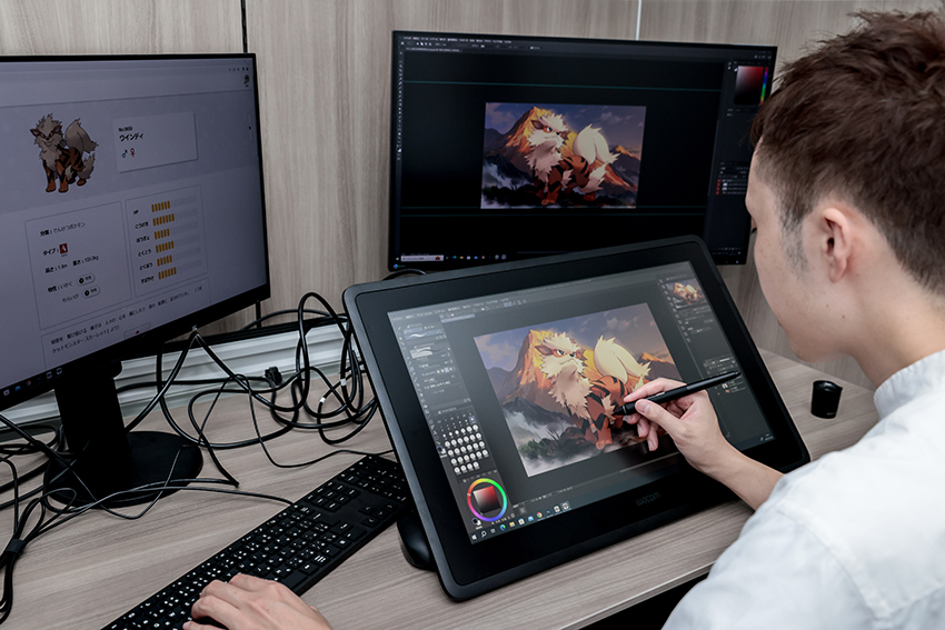
Furusawa: I use Clip Studio Paint, which is an illustration and manga production software application. I sometimes use Adobe Photoshop to apply the finishing touches, but most of my work is done in Clip Studio Paint.
―The supervision of illustrations is carried out by both Creatures Inc. and The Pokémon Company. What kind of feedback or advice do they give you to make your illustrations better fit the world of Pokémon and the Pokémon TCG?
Furusawa: Most of the feedback I receive concerns the shape and color of Pokémon. They give me specific instructions to correct the parts where I interpreted how a Pokémon should look differently from the official standards. Something that made an impression on me in the process of creating Arcanine’s illustration was the feedback I received in regard to the background. I was told that the mountain could look like Mt. Coronet* or Mt. Fuji, and that it would be better to use a more generic mountain range that would fit that world better.
(*Mt. Coronet is a huge mountain that is featured in Pokémon Brilliant Diamond, Pokémon Shining Pearl, and other Pokémon games.)
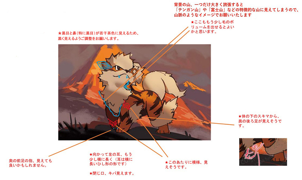
Translation for the notes above, starting from the top left in clockwise order:
- ・ The pupils and nose (especially the former) look a bit too brown. Try to make them blacker.
- ・ Having a single mountain in the background looks like a specific mountain, say Mt. Coronet or Mt. Fuji. It’d be better to have a more generic mountain range.
- ・ This part of the mane would probably look better if it were fluffier.
- ・ The rear leg should probably be visible from here.
- ・ The stripes on its fur should probably be visible here.
- ・ The ear to your left should be a bit longer. (Think of it as a squashed parallelogram.)
- ・ You should be able to see its fangs when Arcanine’s mouth is closed.
- ・ Maybe you could make the separate digital pads on the right rear paw.
―Revising drafts sounds like a difficult and stressful task.
Furusawa: Actually…it’s pretty fun (laughs). When I first started illustrating for Pokémon TCG, I was struggling to make my subjects look like what they were supposed to. But if I follow the feedback I get during the supervision step, the subjects suddenly look like themselves. I’m like, “Oh! This Pikachu finally looks like Pikachu!” (laughs). A tiny adjustment changes the final result considerably, and this process helps me better understand the meaning behind the way the parts of Pokémon are balanced. The supervision step always leaves me impressed by how detailed Pokémon designs really are. It has taught me so much.
Step 3: Final Art Creation and Supervision

―How do you create the final data?
Furusawa: Once the supervision step is complete, all the issues with the draft have been resolved, so I just need to actually draw the illustration. This is probably the most carefree step of the whole process.
―Is there anything you pay particular attention to during this step?
Furusawa: I think that Pokémon designs are composed of relatively few elements. In particular, the first 151 Pokémon—the ones who first appeared in the Pokémon Red Version and Pokémon Blue Version games—have a limited number of defining features that require great attention. So, I take care, for example, to make sure that a specific edge is drawn dynamically enough or that a certain shade is blurred in just the right way.
―What are your principles for drawing backgrounds?
Furusawa: I try to make the backgrounds much more detailed than the subjects to give fullness to the illustrations. Since the designs of the Pokémon themselves are so clean and simple, I use detailed backgrounds to create a contrasting effect. Also, I always want to make it look like the Pokémon are real, actual creatures, so I often go for intricate backgrounds to enhance that realism.
However, the amount of detail for background depends on the specific illustration. For example, when drawing the illustration for Morpeko’s card, I wanted a cuter style, so I drew colorful flowers and bubbly trees, trying not to put too much detail into them. For Staraptor, on the other hand, I went for a more realistic background, with well-defined, cool-looking trees. Just like that, I change the style of the background depending on the illustration itself.
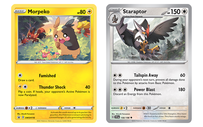
「Morpeko」Illus. Atsushi Furusawa
Pokémon TCG: Sword & Shield—Chilling Reign expansion promo card (June 2021)
「Staraptor」Illus. Atsushi Furusawa
Included in the Pokémon TCG: Scarlet & Violet set
―How do you apply finishing touches such as visual effects and other adjustments?
Furusawa: As I generally try to match the subject with a realistic background, I rarely put an emphasis on visual effects. When I do use them, I always want them to be justified, like putting in snow falling down from the clouds or lightning striking from the sky. For example, I use effects when I show the Pokémon attacking, like in the illustration of Lapras.
That being said, sometimes I want to go for something flashier. When I do, I often find myself using smoke effects to create the right atmosphere, like I did with Toxtricity.
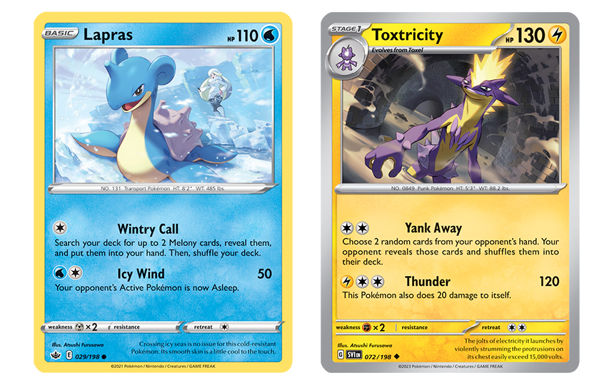
「Lapras」Illus. Atsushi Furusawa
Included in the Pokémon TCG: Sword& Shield—Chilling Reign expansion
「Toxtricity」Illus. Atsushi Furusawa
Included in the Pokémon TCG: Scarlet & Violet set
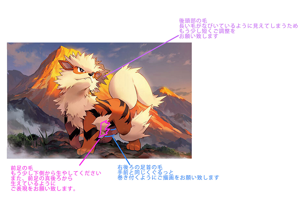
After creating the final draft, there is another round of supervision to make sure that even the smallest details match that Pokémon’s design.
Translation for the notes above, starting from the top left in clockwise order:
- ・ The right part of Arcanine’s mane looks like a ponytail blowing in the wind, so try to make it a bit shorter.
- ・ The fur on the rear leg should curl up like on the front legs.
- ・ Move the light-colored fur so that it starts a bit farther down. Think of it as growing from the back of the hind leg.
Step 4: Completion!
―Tell us about the sense of accomplishment that completing an illustration makes you feel.
Furusawa: I think other illustrators will relate when I say that once I’m done drawing, what I feel is mostly anxiety (laughs). “Is this good enough?” “Will the players like this?” And so on.
I never finish illustrations right before the deadline. I complete them a few days before the deadline, let them sit for a while, and review them over and over. After fine-tuning them enough that I feel I can’t improve on them anymore, I hand them over to Creatures Inc.
What really makes me feel accomplished is getting feedback from the players. Or rather, more than accomplishment, I should say that I feel relief. But despite this relief, I go through my past works and take notes on things that could have been done differently.
―Do you look for reactions on social media on the day the cards you’ve worked on are released?
Furusawa: Oh, I do! I definitely do! (Laughs). After all, my greatest joy is seeing the players enjoying my illustrations. That positive feedback is what makes me feel rewarded for drawing. Each individual Pokémon has lots of fans, and nothing makes me as happy as seeing those fans pleased.
In Conclusion
―Lastly, what would you like to say to the Pokémon Trading Card Game Illustration Contest 2024 applicants?
Furusawa: This is the fourth edition of the Pokémon Trading Card Game Illustration Contest. [Note: This includes the first Pokémon Trading Card Game Illustration Grand Prix, which was only held in Japan.] I’m sure that all of you have seen the winning entries from past editions. I know that seeing those may be very discouraging. Maybe some of you are worried that you cannot draw something on par with them. But remember that just because a certain type of illustration won in the past, it doesn’t mean that you have to follow that specific style.
This is a very valuable opportunity to see different people’s takes on the same subject. Even just applying always pays off. Participating will teach you a lot, so I hope that you will all draw to the best of your ability and submit your illustrations. Do your best and click on that application form!
Composition and text: Shusuke Motomiya (One-up). Photos: Kayoko Yamamoto